

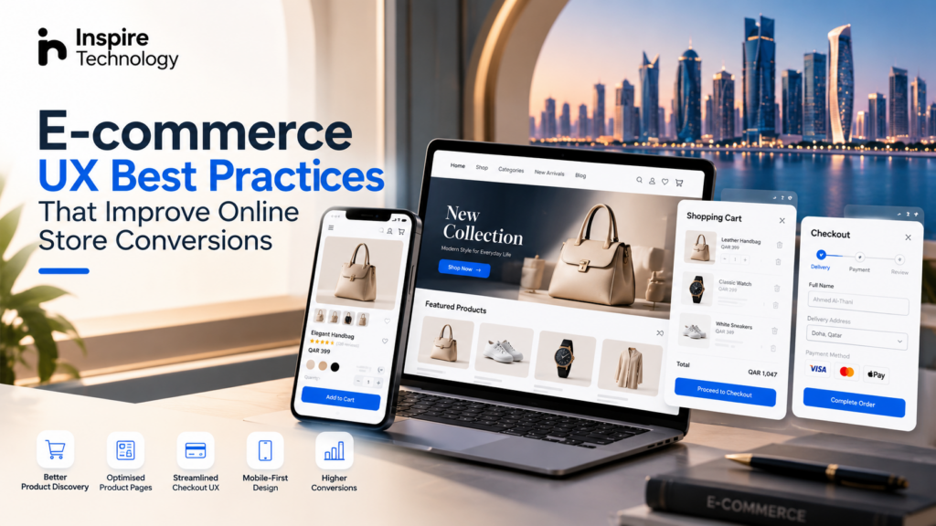
An online store can have excellent products, competitive prices, and strong marketing yet still lose sales because the shopping experience creates friction.
Customers expect to find products quickly, understand their options, trust the business, and complete purchases without unnecessary steps. E-commerce UX design connects these expectations into one smooth customer journey.
Good e-commerce UX covers much more than attractive screens. It includes navigation, product discovery, search, product page structure, mobile usability, cart functionality, checkout UX, payment flows, trust signals, accessibility, and page performance.
For businesses in Qatar, the experience also needs to consider mobile-first shopping, Arabic and English interfaces, local customer expectations, and different payment journeys.
Google’s own guidance reinforces the importance of overall page experience, including mobile usability, Core Web Vitals, secure pages, and avoiding intrusive elements that interfere with the main content.
So, what does an effective e-commerce experience actually look like?
Let’s explore the ecommerce UX best practices that can help online stores reduce friction and create better conversion opportunities.
1. Build Navigation Around Product Discovery
Customers should not need to understand your internal website structure before they can find a product.
A strong navigation system reflects how customers think about products.
For example, a fashion store could organise products around:
- Women
- Men
- New arrivals
- Clothing
- Shoes
- Accessories
- Sale
- Collections
Category pages can then introduce relevant filters such as size, colour, price, material, brand, or availability.
The goal is simple: reduce the distance between the customer’s intention and the product they want.
Clear navigation also supports search engines in understanding relationships between categories, products, and content. A logical information architecture creates useful connections between commercial pages and supporting content.
Keep navigation predictable
Avoid excessive dropdowns, vague category names, and duplicated pathways.
Use familiar labels. Keep important categories visible. Make search easy to locate.
For larger catalogues, combine navigation with:
- Predictive search
- Filters
- Sorting
- Breadcrumbs
- Category landing pages
- Related products
A customer who can find the right product quickly has fewer reasons to leave.
2. Design Product Pages Around Buying Decisions
A product page is one of the most important conversion points in an online store.
Customers cannot physically touch the product. They depend on the page to answer their questions.
Effective product page UX should make important information immediately accessible.
A strong product page can include:
- High-quality product images
- Multiple product angles
- Product name
- Price
- Availability
- Product variations
- Size information
- Key specifications
- Delivery information
- Return policy
- Reviews
- Clear calls to action
- Relevant product recommendations
Product images deserve particular attention. Customers should be able to zoom in, view different angles, and understand the product without guessing.
Product information should also appear close to the relevant decision point.
For example, place size information near the size selector rather than hiding it several sections below the purchase button.
Make the purchase action obvious
The Add to Cart or Buy Now button should have strong visual hierarchy.
Users should immediately understand:
- What they are buying
- How much it costs
- Which variant they selected
- What action they can take next
Clear product information reduces uncertainty. Reduced uncertainty can make the purchasing journey easier to complete.
Google also provides specific guidance around product structured data, which can help Google understand information such as product details, offers, reviews, price, and availability.
3. Simplify the Checkout Experience
Checkout is where purchase intent becomes a transaction.
It is also where unnecessary friction can become particularly expensive.
A complicated checkout may ask users to create an account, enter information multiple times, navigate several pages, or search for payment and delivery information.
A better checkout UX keeps the process focused.
A practical checkout flow can include:
Cart → Customer details → Delivery → Payment → Order confirmation
Show users where they are in the process. Keep forms concise. Provide clear validation messages. Make errors easy to correct.
Avoid forcing customers to repeat information that the system already knows.
Guest checkout can also remove an unnecessary barrier for first-time customers. Account creation can be offered after the purchase instead of becoming a prerequisite.
For Qatar-based stores, checkout design should also account for local payment methods, bilingual interfaces, mobile interactions, delivery information, and currency presentation.
4. Design for Mobile Commerce First
Mobile UX is no longer a secondary version of desktop UX.
Customers can discover a product through social media, search, advertising, messaging platforms, or direct visits and then complete the entire purchase from a smartphone.
That changes how an e-commerce interface should be designed.
A mobile-first store should prioritise:
- Thumb-friendly controls
- Readable typography
- Fast product discovery
- Sticky purchase actions where appropriate
- Simple filters
- Easy image interaction
- Short forms
- Fast-loading pages
- Clear navigation
- Mobile-friendly payment flows
Touch targets need enough space to prevent accidental clicks. Product images need to remain useful on smaller screens. Important information should not disappear behind excessive tabs or interaction layers.
Google identifies mobile usability, Core Web Vitals, security, and intrusive-interstitial avoidance as important components of overall page experience.
5. Reduce Cart Abandonment Through Better UX
Cart abandonment does not always indicate a lack of interest in the product.
Sometimes the interface creates uncertainty at the final stage.
Customers may abandon a cart when they encounter:
- Unexpected delivery charges
- Complicated forms
- Limited payment options
- Unclear returns
- Slow pages
- Forced account creation
- Unclear delivery times
- Unexpected fees
- Technical errors
Good cart UX addresses these concerns before the customer reaches the final payment step.
Display the product, quantity, price, shipping information, discounts, and estimated total clearly.
Allow customers to edit quantities or remove products without restarting the process.
A useful cart should feel like a confirmation stage, not another obstacle.
6. Add Trust Signals at the Right Moments
Trust matters throughout the customer journey, but its importance increases when a user is deciding whether to pay.
Relevant trust signals can include:
- Customer reviews
- Verified purchase indicators
- Secure payment information
- Clear return policies
- Delivery estimates
- Contact information
- Business information
- Warranty details
- Customer support options
The placement matters.
A return policy hidden in the footer has less immediate value than a concise return message near the purchase decision.
Avoid overwhelming users with badges and icons. Trust signals should support the buying decision rather than turn the interface into a collection of visual noise.
7. Make Search More Useful
Internal search becomes increasingly important as product catalogues grow.
A customer searching for a specific product usually has stronger purchase intent than someone casually browsing.
Good e-commerce search should handle:
- Product names
- Brands
- Categories
- Common spelling variations
- Product attributes
- Colours
- Sizes
- Relevant synonyms
Search results should also provide useful filtering and sorting.
For example, a search for “black running shoes” should help users narrow results by size, brand, price, gender, or availability.
Zero-result pages also deserve attention.
Instead of simply displaying No results found, provide alternative categories, related products, spelling suggestions, or broader search options.
8. Use Personalisation Without Making the Interface Confusing
Personalisation can improve product discovery when it adds genuine relevance.
Examples include:
- Recently viewed products
- Recommended products
- Related products
- Frequently purchased products
- Complementary products
- Location-aware delivery information
However, recommendation modules should support the shopping journey rather than dominate it.
A product page for a laptop might recommend compatible accessories. A fashion store might recommend matching products. A grocery store might suggest frequently purchased items.
Relevant recommendations create a natural path through the catalogue.
9. Treat Arabic and English UX as Separate Design Requirements
For businesses serving Qatar, bilingual design deserves attention from the beginning.
Arabic interfaces require right-to-left (RTL) layouts. Simply translating English text into Arabic and placing it into the same interface can create spacing, alignment, hierarchy, and interaction problems.
Important considerations include:
- RTL navigation
- Arabic typography
- Text alignment
- Icon positioning
- Form direction
- Product information hierarchy
- Responsive behaviour
- Language switching
- Mixed Arabic-English content
Inspire Technology’s e-commerce design process includes Arabic RTL support and bilingual interface planning from the initial design stage.
That approach helps prevent bilingual functionality from becoming a late-stage patch.
10. Improve Page Performance Without Sacrificing Design
Beautiful interfaces become less useful when pages take too long to load.
Large product images, excessive scripts, third-party tools, animations, and poorly optimised assets can affect the shopping experience.
E-commerce teams should monitor:
- Largest Contentful Paint
- Interaction to Next Paint
- Cumulative Layout Shift
- Image sizes
- JavaScript execution
- Server response time
- Mobile performance
Google recommends looking at page experience as a broader system rather than chasing a single metric or perfect score. Core Web Vitals form part of that assessment, but usability and the overall experience also matter.
Performance optimisation should therefore work alongside UX design.
11. Use Data to Find UX Friction
UX decisions should not stop when the design reaches production.
Analytics can reveal where users struggle.
Useful data sources include:
- Google Analytics
- Search Console
- Heatmaps
- Session recordings
- Conversion funnels
- On-site search data
- Checkout analytics
- A/B testing
For example, a high product-page exit rate could indicate unclear information, weak imagery, pricing concerns, or a technical problem.
A high checkout abandonment rate could point toward payment issues, unexpected costs, complicated forms, or trust concerns.
The data does not automatically explain the problem. It helps identify where further investigation should happen.
12. Connect UX, SEO and Conversion Strategy
E-commerce UX and SEO should not operate as separate projects.
A well-structured store can help both users and search engines understand the catalogue.
Consider the relationship between:
Category → Subcategory → Product → Related Products → Supporting Content
Each layer should have a clear purpose.
Category pages can target broader commercial searches. Product pages can address specific product intent. Supporting guides can answer informational questions and introduce customers to relevant products.
Structured data can also help Google understand product information. Google supports structured data for product snippets, merchant listings, variants, reviews, and other search experiences.
However, structured data should describe visible, accurate content. It does not replace useful UX or guarantee a particular search appearance.
E-commerce UX Checklist
Before launching or redesigning an online store, review the following:
| UX Area | Key Question |
| Navigation | Can customers find products quickly? |
| Search | Does internal search understand product intent? |
| Product pages | Does the page answer key buying questions? |
| Images | Can customers inspect products clearly? |
| Mobile | Can users complete the journey comfortably? |
| Cart | Are costs and product details transparent? |
| Checkout | Are unnecessary steps removed? |
| Payments | Are relevant payment options available? |
| Trust | Are reviews, policies and business information accessible? |
| Performance | Does the store remain fast on mobile? |
| Accessibility | Can different users navigate and interact effectively? |
| Analytics | Can the team identify conversion friction? |
| SEO | Are categories, products and supporting content logically connected? |
| Bilingual UX | Does Arabic RTL work as well as English? |
How Inspire Technology Approaches E-commerce UX Design
Effective e-commerce design starts before the visual interface.
Inspire Technology’s process covers business analysis, customer journey mapping, store structure, wireframing, UI design, responsive optimisation, Arabic RTL support, prototyping, usability testing, and developer handoff.
The team works across Shopify, WooCommerce, Magento, OpenCart, BigCommerce, and custom e-commerce platforms, depending on the requirements of the business.
That approach connects design decisions to the wider commerce system rather than treating UX as a cosmetic layer.
Explore Inspire Technology’s E-commerce Design Services
Final Thoughts
The strongest ecommerce UX best practices have one thing in common: they reduce friction between customer intent and purchase.
Clear navigation helps customers discover products. Strong product page UX answers buying questions. Mobile-first design supports modern shopping behaviour. Simplified checkout reduces unnecessary obstacles. Trust signals address uncertainty. Performance keeps the experience responsive.
For Qatar businesses, bilingual Arabic-English UX adds another important layer. The interface needs to work naturally across languages, devices, payment journeys, and customer expectations.
E-commerce UX is therefore more than visual design. It is the structure connecting discovery, evaluation, trust, purchase, and retention.
A store that makes every stage easier gives customers fewer reasons to leave and more reasons to continue.
Ready to improve your online store experience? Talk to Inspire Technology about e-commerce design services in Qatar
FAQs
What is e-commerce UX?
E-commerce UX is the design of an online shopping experience, including navigation, product discovery, product pages, cart functionality, checkout, mobile usability, and customer interactions.
What are the most important e-commerce UX best practices?
The key areas include simple navigation, strong product page UX, mobile-first design, transparent pricing, streamlined checkout, useful search, trust signals, fast performance, and continuous usability testing.
How does UX affect e-commerce conversions?
UX can influence how easily customers discover products, understand product information, resolve concerns, and complete purchases. Removing unnecessary friction can make the purchasing journey easier to navigate.
How can UX reduce cart abandonment?
A clear cart and checkout experience can reduce friction by showing total costs, delivery information, payment options, product details, and necessary forms clearly.
Should an e-commerce website be designed for mobile first?
A mobile-first approach is useful because customers increasingly browse and purchase through smartphones. Responsive layouts, touch-friendly controls, readable content, fast loading, and simplified checkout should be considered from the beginning.
Does Arabic RTL affect e-commerce UX design?
Yes. Arabic requires right-to-left interface considerations that can affect navigation, typography, alignment, forms, icons, spacing, and responsive layouts. Bilingual UX should therefore be planned during the design stage rather than added after development.
Can better e-commerce UX improve SEO?
UX and SEO have different purposes, but they can support each other. Logical site architecture, useful content, accessible pages, strong mobile experience, and clear product information can help create a better experience for users and make site content easier for search engines to understand.