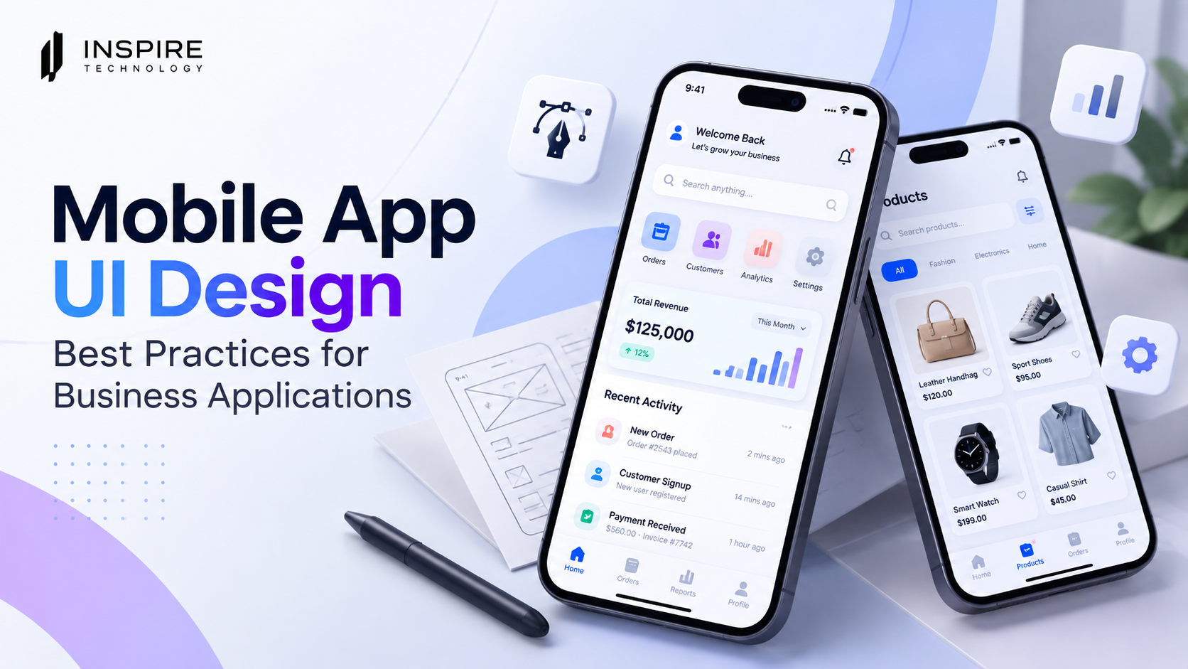

A business application can have powerful features and still frustrate users if its interface feels confusing. Mobile app UI design plays a major role in how quickly employees, customers, and business partners understand an app and complete important tasks.
Business apps often handle complex processes such as payments, customer management, inventory, bookings, reporting, approvals, and communication. A strong interface turns that complexity into clear, manageable interactions.
Good UI design also supports a better mobile app UX. Users should know where they are, what they can do next, and how to recover when something goes wrong. Apple’s current design guidance similarly emphasizes purpose, familiarity, simplicity, flexibility, accessibility, and clear feedback as foundations of effective interfaces.
For businesses in Qatar and other fast-moving markets, Our mobile app design services goal should be simple: create an app that looks professional, works efficiently, and helps users complete tasks without unnecessary friction.
What Is Mobile App UI Design?
Mobile app UI design is the process of designing the visual and interactive elements of a mobile application. It includes screens, navigation, buttons, typography, colors, icons, forms, menus, cards, notifications, and other interface components.
UI focuses on what users see and interact with. UX focuses more broadly on how the entire experience works.
A successful business application needs both.
For example, an inventory application may include hundreds of products and several management functions. A cluttered interface can make routine tasks difficult. A well-planned interface can organize products into logical categories, provide clear search and filtering options, and place important actions where users can find them quickly.
That difference makes app interface design more than a visual exercise. It becomes part of the application’s overall business strategy.
1. Start With Business and User Goals
Effective mobile app UI design starts before the first screen is created.
First, identify what the application needs to accomplish. Then identify who will use it and what they need to achieve.
A customer-facing app may prioritize:
- Product discovery
- Account management
- Payments
- Orders
- Customer support
- Notifications
An internal business application may prioritize:
- Data entry
- Approvals
- Reporting
- Employee workflows
- Inventory management
- Task management
Each audience requires a different interface strategy.
Designers should map the most important user journeys before creating detailed screens. The process helps eliminate unnecessary steps and gives every screen a clear purpose.
Apple’s design principles also recommend focusing on the core purpose of a product and prioritizing the features that matter most to users.
2. Keep Navigation Simple and Predictable
Business applications can contain many features. That does not mean every feature needs to appear in the primary navigation.
A strong navigation system groups related functions and creates a predictable structure.
For example, an enterprise application might organize its primary navigation around:
Home → Tasks → Customers → Reports → Profile
The exact structure depends on the application, but the principle remains consistent. Users should not have to repeatedly search for essential functions.
Avoid unnecessary navigation layers. Keep labels understandable. Use familiar icons where appropriate, but pair important icons with text when their meaning may not be immediately clear.
Consistency also matters. If a button performs a particular action on one screen, users should understand what that same button does elsewhere.
3. Design for One-Handed Mobile Use
Mobile users often interact with applications while standing, walking, commuting, or multitasking.
Your interface should account for real-world usage.
Place frequently used actions within comfortable reach. Give important buttons enough space to tap accurately. Avoid putting critical controls too close together.
Touch targets should also accommodate users with different levels of dexterity. Apple’s current accessibility guidance specifically recommends sufficiently sized controls and familiar interactions that make actions easier to perform.
For business applications, small interaction mistakes can create bigger operational problems. A misplaced tap on a payment, deletion, approval, or submission action can have consequences beyond the interface itself.
4. Build a Responsive App Design System
Users may access the same business application across different phones, tablets, orientations, and screen sizes.
Responsive app design should account for those differences from the beginning.
Layouts should adapt rather than simply stretch. Content hierarchy should remain clear when screen dimensions change. Buttons, forms, images, tables, and navigation elements should maintain appropriate spacing and proportions.
Apple’s September 2026 layout guidance specifically highlights the need for interfaces to adapt across display sizes, orientations, window sizes, text sizes, and other device conditions.
A responsive approach can help maintain a familiar experience across devices instead of forcing users to relearn the interface each time they switch screens.
5. Prioritize Content Hierarchy
A mobile screen has limited space. Every element competes for attention.
Strong visual hierarchy helps users understand what matters first.
Use differences in:
- Font size
- Font weight
- Spacing
- Color
- Position
- Component size
- Grouping
For example, a business dashboard could present:
Revenue
$125,000
Orders
1,240
Pending Approvals
18
The most important information should be immediately visible. Secondary information can appear lower in the hierarchy.
Avoid filling every available area with content. White space can separate functions, improve scanning, and reduce cognitive load.
6. Make Forms Fast and Easy to Complete
Forms are common in business applications, yet they are also a frequent source of friction.
Ask only for information that is necessary.
Use:
- Clear field labels
- Appropriate keyboard types
- Dropdowns when choices are limited
- Date and time selectors
- Input validation
- Helpful error messages
- Autofill where appropriate
- Logical field order
Do not make users restart a long form after an error.
Error messages should explain what happened and how to fix it. For example, “Enter a valid phone number” provides more useful guidance than “Invalid input.”
The interface should help users recover from mistakes rather than punish them for making one.
7. Design Clear Feedback and System States
Users need confirmation that their actions have worked.
A good business application communicates important states such as:
- Loading
- Saved
- Submitted
- Processing
- Failed
- Offline
- Completed
Consider a payment screen. After a user taps Pay, the application should provide visible feedback. A blank screen or frozen button can make users wonder if the transaction worked.
Apple’s design guidance emphasizes clear feedback so people understand when controls are available, when content changes, and what is happening within the interface.
Small feedback elements can therefore have a significant effect on trust.
8. Build Accessibility Into the Interface
Accessibility should not become a final-stage checklist.
Design business applications so people with different abilities can navigate and understand them.
Consider:
- Readable text sizes
- Sufficient color contrast
- Clear labels
- Screen reader support
- Large enough interactive controls
- Alternative ways to receive important information
- Reduced-motion preferences
- Logical navigation
Apple’s current accessibility guidance recommends interfaces that are intuitive, perceivable, and adaptable. It also highlights contrast, larger text, comfortable controls, and reduced-motion support.
Accessibility can also improve usability for everyone. Clearer labels, stronger contrast, and simpler navigation benefit users across many situations.
9. Use Consistent Components and Visual Patterns
A business application should feel like one product, not a collection of unrelated screens.
Create a reusable design system for:
- Buttons
- Forms
- Cards
- Navigation
- Alerts
- Modals
- Icons
- Typography
- Colors
- Spacing
Consistency reduces the amount of learning required from users.
If every screen uses different button styles or interaction patterns, users have to figure out the interface repeatedly. A consistent system creates familiarity and makes future features easier to integrate.
10. Test the Interface With Real Users
Design assumptions can look convincing in Figma and still fail during real-world use.
User testing can reveal problems such as:
- Users missing important buttons
- Confusing navigation
- Difficult forms
- Unclear error messages
- Unexpected interactions
- Excessive steps
- Poor readability
Test important workflows rather than only individual screens.
Ask users to complete realistic tasks. Observe where they hesitate, make errors, or ask for help.
The findings should influence the next design iteration.
11. Optimize for Performance and Mobile Usability
A beautiful interface cannot compensate for a slow or unreliable application.
Performance should be considered alongside visual design. Large images, unnecessary animations, excessive requests, and inefficient interactions can create frustration.
Google’s current Search guidance also emphasizes good page experience, including mobile usability, performance, secure delivery, and avoiding intrusive experiences.
Although app performance involves more than UI, designers and developers should work together from the beginning. Lightweight components, optimized assets, clear loading states, and efficient interactions can contribute to a smoother experience.
12. Design for Business Growth
A business application rarely stays the same.
New users, features, markets, integrations, and workflows can appear after launch. Your UI system should accommodate that growth.
Create flexible components rather than designing every screen as a one-off solution.
A scalable design system can make future development more consistent and reduce redesign work when the product expands.
For companies planning custom mobile applications, professional mobile app design services can help translate business requirements into user flows, wireframes, visual systems, prototypes, and production-ready interfaces
Common Mobile App UI Design Mistakes to Avoid
Even experienced teams can introduce unnecessary friction.
Watch for these common problems:
Too many features on one screen
More features do not automatically create more value. Prioritize the actions users perform most often.
Inconsistent navigation
Changing navigation patterns from one screen to another increases cognitive effort.
Tiny touch controls
Small buttons can create accidental taps and accessibility problems.
Weak error handling
Users need clear explanations and practical recovery options.
Excessive animations
Animation should support understanding, not distract from the task.
Ignoring different devices
A layout that works on one phone may fail on another screen size or orientation.
Designing without user testing
Internal teams understand the product deeply. That can make it difficult to spot confusing experiences that seem obvious to the people who built them.
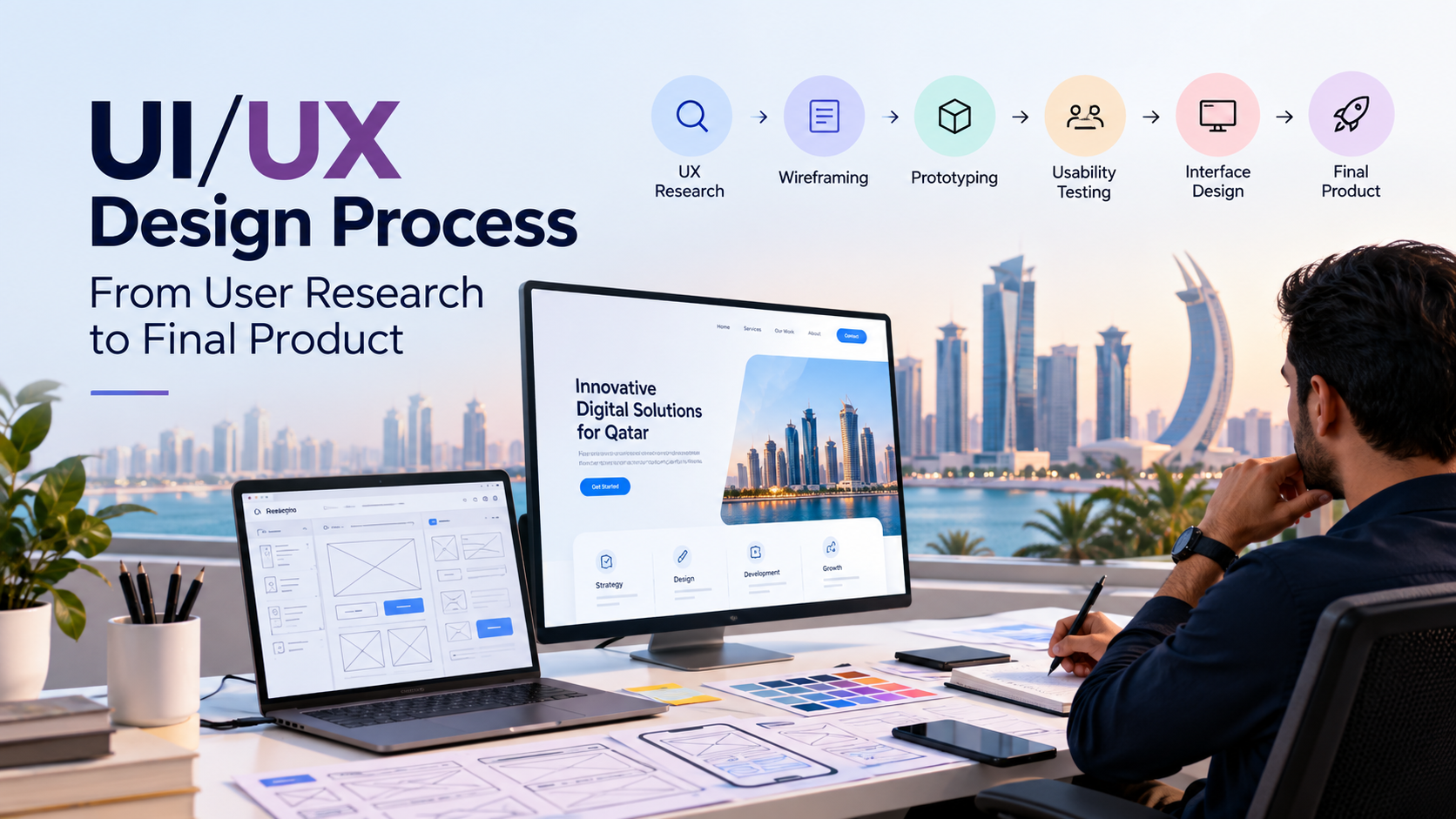
How to Create Better Mobile App UI Design
A practical process can look like this:
1. Research
Understand users, business goals, workflows, and technical requirements.
2. Define user flows
Map the steps required to complete important tasks.
3. Create wireframes
Establish layout and hierarchy before focusing heavily on visual styling.
4. Develop the design system
Define typography, colors, components, spacing, icons, and interaction patterns.
5. Build prototypes
Create realistic interactions for important workflows.
6. Test
Observe real users completing realistic tasks.
7. Refine
Fix usability problems and simplify unnecessary interactions.
8. Collaborate with development
Ensure the final product matches the intended experience across supported devices.
This people-first approach aligns with Google’s guidance that valuable content and digital experiences should serve users rather than exist primarily to manipulate search visibility.
Final Thoughts
Great mobile app UI design is not simply about making an application look modern. It is about making complex business processes easier to understand and complete.
The strongest business applications combine clear navigation, responsive layouts, accessible interactions, useful feedback, consistent components, and continuous user testing.
For businesses in Qatar, the right approach also depends on the application’s audience, industry, workflows, and growth plans. A customer-facing retail app will require different decisions than an internal logistics, healthcare, finance, or enterprise application.
When UI design starts from real user needs and business objectives, every screen has a job. Every interaction becomes easier to understand. And the final product becomes far more useful than a collection of attractive screens.
FAQs
What is mobile app UI design?
Mobile app UI design covers the visual and interactive elements of a mobile application, including screens, navigation, buttons, typography, forms, colors, icons, and other interface components.
What is the difference between mobile app UI and UX?
UI focuses mainly on the interface and how it looks and behaves. UX covers the broader user experience, including workflows, usability, navigation, interactions, and how effectively users achieve their goals.
Why is responsive app design important?
Responsive app design helps an application adapt to different screen sizes, orientations, and devices while maintaining a clear and consistent experience.
How can businesses improve mobile usability?
Businesses can improve mobile usability through simple navigation, readable content, appropriately sized controls, accessible forms, clear feedback, fast interactions, responsive layouts, and user testing.
When should businesses invest in professional mobile app design?
Professional design support becomes particularly useful when an application involves complex workflows, multiple user groups, sensitive business processes, or plans for long-term growth.